Numbered header using flexbox with fallback
One of the designs I recently had to work on needed a narrow width header in a sidebar with a large number on the left side of it and the header text vertically centered to the right.
If you've worked with CSS for awhile you've probably ran into the same issue as everyone else. Vertical alignment with universally supported css is not easy. There are multiple techniques you can use to make something vertically aligned but there are drawbacks to each.
For my use case I couldn't use any of the normal tricks I'd use. I didn't know the exact height of the number and I needed the header text on the right to wrap properly. So I couldn't use a typical technique involving line-height, absolute positioning, or padding.
I ended up deciding to try using css3-flexbox to create the design in a way that would fall back in browsers that don't support flexbox to a secondary layout which would still at least look presentable.
The technique involves two divs inside of a header. One containing the number. I put role="presentation" on this one since it's really just for the visual design. And a second div containing the actual text of the header.
<h2 class="numberheader">
  <div class="nh-number" role="presentation">1</div>
  <div class="nh-content">This is the text of a numbered header</div>
</h2>
This is the fundamental css for the technique. This isn't all the css you'll need. You're obviously going to want to give a large font size to the div containing the number (.nh-number) and maybe a color to. And you probably want to play with the header style maybe changing the weight, etc... But this is the base css for the technique. Some flexbox properties, a float, and a line-height on the number to eliminate the white space above and below the number that aren't needed.
.numberheader {
  display: -ms-flexbox;
  display: -webkit-flex;
  display: flex;
  -ms-flex-align: center;
  -webkit-align-items: center;
  align-items: center;
}
.numberheader .nh-number {
  float: left;
  line-height: 0.8;
}
.numberheader .nh-content {
  -ms-flex: 1;
  -webkit-flex: 1;
  flex: 1;
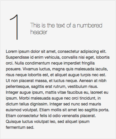
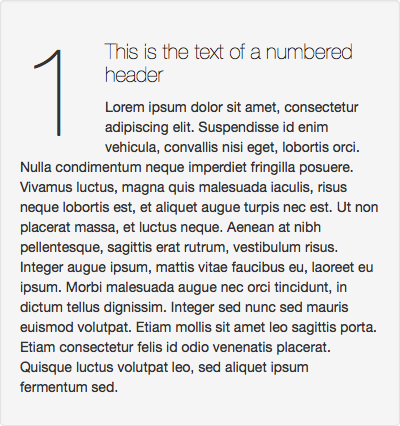
}You can see a demo of the technique. Figure 1 shows the demo as it looks to browsers that support the recent flexbox spec and figure 2 shows the fallback for those that don't.


I didn't bother with the really old flexbox implementations since the latest versions of most WebKit based browsers and Firefox have moved on an implemented the latest version of the flexbox spec. Firefox is even prefix-less, yay! Additionally I've worked with it in the past and vaguely remember the old implementations not playing as nicely with float and margin fallbacks as the new implementations do.
I should make one last note about the technique. The use of a div instead of a span and the extra div around the header text are actually all just for IE10 support. IE10 implements a slightly older version/syntax of the spec. In it's implementation without the use of block elements and an explicit flex the header text will not wrap and as a result will bleed out of the header continuing out to the right overlapping any content there.
If you don't care about IE10 you can actually modify this technique. Remove the element wrapping the header text and the associated css rule ie: .numberheader .nh-content in the example. And the div with the number can be made a span instead. And finally remove display: -ms-flexbox; and -ms-flex-align: center; from the header. This should work fine in IE11+ and the rest of the modern flexbox supporting browsers.